The in-flight safety video created by BETC for Air France is one of the more elegant examples of branded content I’ve seen recently. It takes the banal instructions about seatbelts and oxygen masks and turns them into a beautifully choreographed fashion parade, along the same lines as the agency’s «France is in the air» spot.
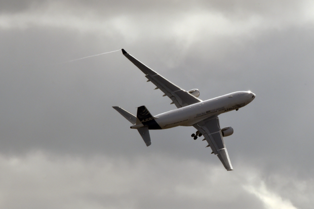
Air France is not the first to have taken advantage of this space: Virgin America came up with a funky song-and-dance version of its safety video in 2013. But somehow the French version seems even more consistent with the airline’s DNA. In fact, aircraft are full of branding opportunities, from the traditional in-flight magazine (does anybody read these any more, except to check the menu and the movies?) to the increasingly generous entertainment systems, the décor and of course the cabin crew’s uniforms. Flying is a far more stressful and noisy experience than the advertising suggests, but these little touches add humanity.
But perhaps even more could be done. One of the things I dislike about flying is its total disconnection with reality. In a train, you’re passing through a visible landscape. A plane is a tin can hurtling through a void. Which is why I like to follow the little electronic route map that tells you where you are. Hey, the Andaman Islands, cool! It makes me feel a tiny bit like Indiana Jones.
But how about an interactive version? I could touch the Andaman Islands and a five-minute video could pop up telling me something about their culture and history. Imagine how much I could have learned about the world on my recent flight from Doha to Jakarta? Instead I learned that Tom Cruise is good at fighting aliens and that Birdman is even better than the after-dinner wine at sending me to sleep. Unfortunately, it’s not just the plane that’s the problem. The stress begins at the airport. The long lines, the terse staff, the indignity of shoe removal. Any ideas for making check-in and security more glamorous, BETC?


